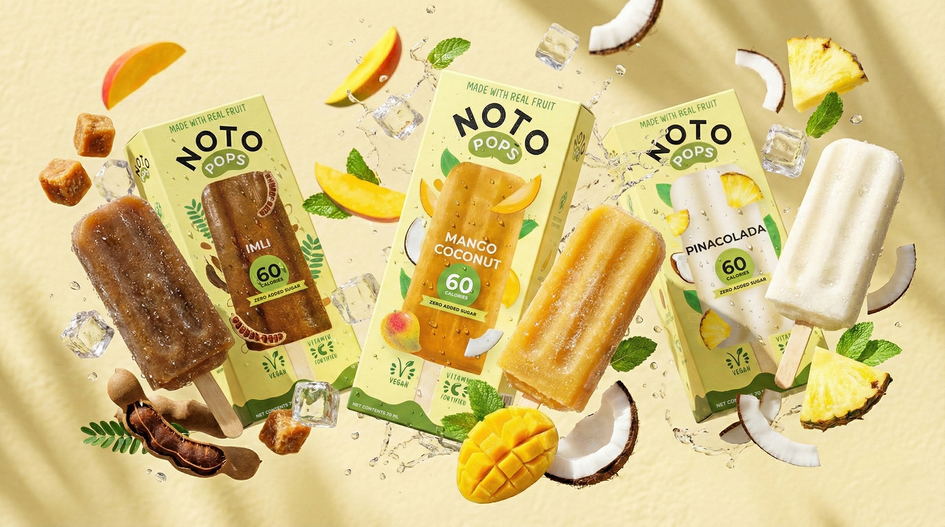
NOTO Pops reimagines ice cream for the conscious consumer.
Low calorie, zero added sugar with no preservatives, artificial sweeteners of flavours.
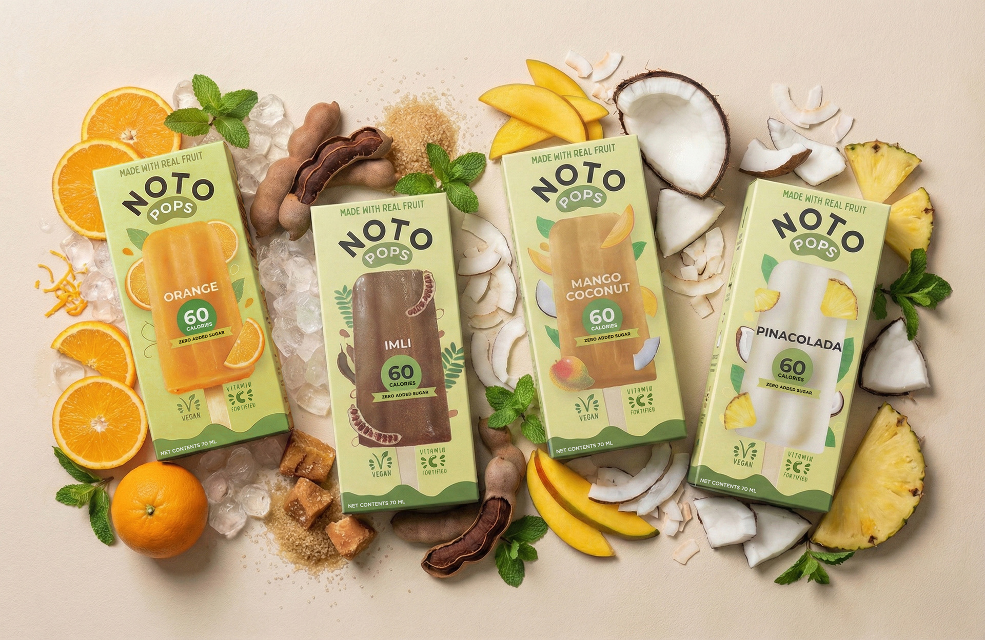
The packaging was designed to break away from the muted, “health food” look and make low-calorie ice cream feel fun and exciting. Bold, bright pop colours and vibrant fruit illustrations were used to instantly communicate flavour, freshness, and taste on shelf.
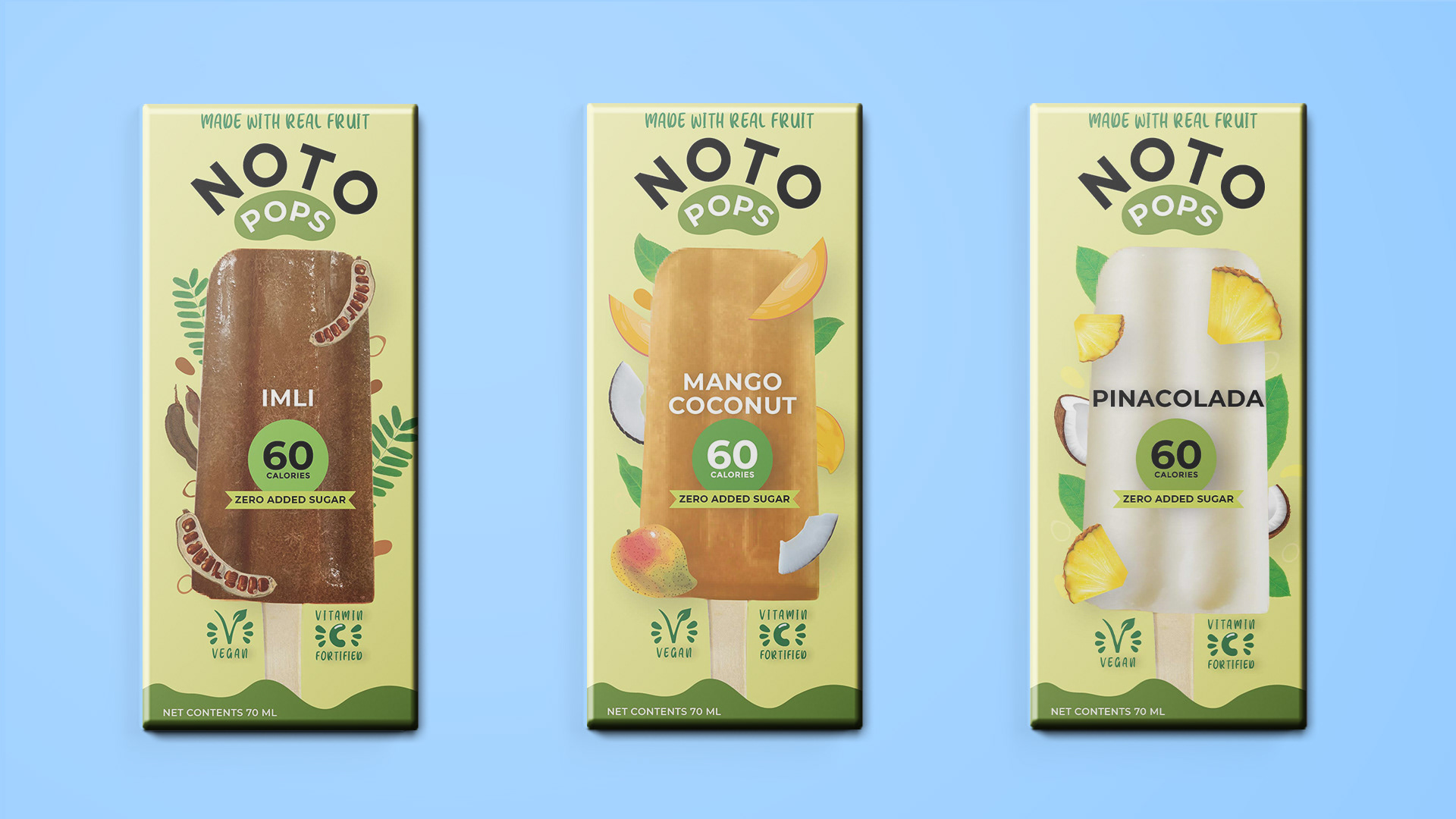
The playful colour palette helps the product stand out in a crowded freezer aisle while reinforcing NOTO Pops’ modern, youthful, and positive brand personality.
Role : Art Direction, Packaging Design
Agency : DesignAnswers
Creative Directors : Praneeta Shringi and Hitesh Nigam